This site uses cookies to improve your experience. To help us insure we adhere to various privacy regulations, please select your country/region of residence. If you do not select a country, we will assume you are from the United States. Select your Cookie Settings or view our Privacy Policy and Terms of Use.
Cookie Settings
Cookies and similar technologies are used on this website for proper function of the website, for tracking performance analytics and for marketing purposes. We and some of our third-party providers may use cookie data for various purposes. Please review the cookie settings below and choose your preference.
Used for the proper function of the website
Used for monitoring website traffic and interactions
Cookie Settings
Cookies and similar technologies are used on this website for proper function of the website, for tracking performance analytics and for marketing purposes. We and some of our third-party providers may use cookie data for various purposes. Please review the cookie settings below and choose your preference.
Strictly Necessary: Used for the proper function of the website
Performance/Analytics: Used for monitoring website traffic and interactions
A Guest Post By Shayla Costa, UMASS at Amherst Student, Winner of the PR Expanded Infographic Contest. An assignment in my Principles of Public Relations class with Professor Jennie Donohue was to read Deirdre Breakenridge’s new book Answers for Modern Communicators and create an infographic based on one of four concepts.
Data visualization is hot right now and the media loves infographics. this video tutorial will walk you through the basic steps of using Canva to make an infographic. the steps of course also apply to any graphic you would like to make using Canva. 80%+ of editors and publishers want good visuals with their news content.
Of course, there’s a highlight reel on social media. Are you using social media to get closer with people to build your own personal brand? The data you collect and analyze on social media is based on what people want to share with you, and how they want to be seen.
Here is how I’ve integrated these stages into courses. Faculty might have students create blogs, use a course learning software’s discussions, or even create a Facebook Group. One way I do this is by having students create infographics around a given topic. Creating personal learning environments.
Of course this response flow chart is only one piece of the puzzle. Crisis and Issues Management Dealing with Negative Criticism Employees and Crisis Management Infographics' Create appropriate messaging for responding to issues. It’s only one piece of the puzzle.
The easiest way to do that is by including multimedia elements — whether photos, infographics, videos or audio clips. Accountemps has identified a relatable problem for professionals — whether to stay or go, and they’re offering their expertise on what the data shows is the right course of action. Personalize Your Brand. Conclusion.
Winning presentations are highly tailored, so it pays to know as much as possible about the targets and, of course, the industry. of proposals see higher engagement from visuals such as infographics and original images. . What do they want to see in a relationship? What are their hot buttons? Their backgrounds? Make it look appealing.
Infographics remain high on the marketing list of tactics. This week I looked at Google search data for the word “infographic” (and variations) and found interest continues to grow at a steady pace. We see infographics in content marketing survey results as well. But Those Troubled Infographics. 1) Data visualization.
Download the full PDF version of the infographic here . Adding data visualizations , infographics, images, and videos to your text not only makes it more interesting and attractive, but it can help your message to be absorbed better too. Course-correct if you are not making headway and reaching your milestones.
But the problem is the days of “if you build an infographic, people will – of course – read it and love it” are OVER. The head-on approach to customer acquisition works less, and the indirect approach (via content marketing in many cases) works better….in There is more content than ever, but most content fails miserably.
Design: An awful lot of content today is visual – photography, original images, social media images and infographics. Learn more about these Digital Skills in a free email course and be ready for 2018. And video is growing at breakneck speed. Design skills are highly valued and likely to be more so in 2018. Image from TEKsystems.
So whilst thinking about what formats can work best, try to avoid saying “I want to create an infographic” or “I want to create a video”. This is often easier than updating a more complex execution such as an interactive infographic because it is usually a case of updating copy and visuals with new ones. Static infographic.
I'm also fascinated by leadership so when I stumbled upon this HBR research on what leadership looks like in different cultures during an online course on International Project Management , I had to dig deeper into it and decided to summarise my learnings in the below infographic.
If your immediate reaction is ‘games, of course’, think again. Infographic courtesy of Kargo.com. And that’s not just the majority of mobile time, that’s the majority of all digital time. Does any of this matter to PR? Take a look at what people are viewing on their mobile devices. percent access content/information.
Check out our infographic to find out what to do to protect your mobile device … and your identity!” ” Below I’ve embedded the infographic they linked to. Here is Desjardins’s infographic: Infographic originally published here. My banking information must be good and secure with them.”
Infographic: Step Up—Or Step Back Practice symbolic pacing in your communicative leadership. Step Up—Or Step Back (Infographic) Symbolic pacing in communicative leadership. PR Resource: Leadership PR Course Free leadership PR course. Thanks for reading. You might also consider my PR services or speaking engagements.
Add eye-catching multimedia that makes your content stand out from the crowd, like an infographic, product picture or action shot. If you’re looking to drive awareness and engagement actions among more than just your most loyal fans (regular visitors to your blog), then you’ll want to chart a course to place your post on outside channels.
Of course, quantity is nothing without maintaining quality. Another easy way to take a blog post or other content to the next level is by creating an infographic with help from a site like Picktochart or Venngage. If this is too Draconian, you can go old school with a timer to nudge up your daily writing output. DesignerPics.
Often the news can be raw and eye-opening and has the power to change the course of industry and the world. Our 2016 timeline infographic highlights some of the monumental challenges that affected journalists last year. The media attention that companies get can positive or negative. And that’s ok. That is how it must be.
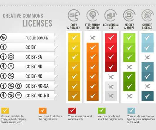
You should of course run this past your legal team. The images published below are based on an infographic by Foter that explains the concept graphically. Creative Commons has several different licenses that can both meet your needs and clearly facilitate sharing. It’s a free and easy step to literally ‘pull out all the stops.’.
Here’s a fun infographic from the folks over at Domo about how much is happening in an Internet minute. Today, of course, we’d hope it would go into the recycling bin or the compost bin because we’re a little more progressive.) Of course not. Earlier this year, Mark Schaefer proposed the idea of what he calls content shock.
That’s right, you’re competing against baby pictures, crazy Saturday night pre-game photos, all things Buzzfeed, and, of course, cat videos and cat memes. Her firm still gets major website traffic from an infographic they posted over two years ago. What happens to an infographic you posted to Facebook even two days ago?
My course, Social Media and Public Relations, kicked off last week with the students building and branding their Twitter profiles and actively engaging in our classroom community (#UMASSPRSM). Summer class for the UMASS Journalism Online Program is officially in session. Participate in Twitter chats.
Comment: The survey data about engagement in digital reflects my experience over the course of my career. 3) The CMO Council infographic on CMO priorities. right click infographic an open in a new window, then click on image for higher resolution ). * * *. 29% more likely than their peers to be in-sourcing new capabilities.”. “21%
The same study points out there’s some content – infographics for example – is rarely gated. He’s never seen a piece of gated content go viral…unless of course, you use this one weird trick. If you enjoyed this post, you might also like: What a Grumpy Cat Infographic Can Teach us About Marketing.
The second is that respondents are underestimating the rise of visual communications—infographics and animation and video more broadly—and the other new skills we need to attract.” For new PR graduates and anyone who started out in PR before the year 20o5, this free email course is a perfect way to start improving your digital skills.
Of course, when, where, and how all depends on your audience. 5 Artificial intelligence Of course, we can use AI for just about anything nowadays. Sometimes, you might want to collect these answers at industry conferences, universities, or other places where your consumers spend time. 3 You need to increase social media engagement.
Of course, to be able to do this effectively, you’ll need to know who your audience is. This means photos, infographics and other graphic elements that break up large chunks of text. Infographics. Your blog should sound like a conversation you’d have with a friend because you’re treating your customer as a friend. Use Imagery.
Lastly, of course established influencers should be paid for their work. You’d pay for a photo shoot or an infographic or a video production, right? They likely have day jobs and are spending time on generating content for you. What advice do you have for those looking to begin a career in PR?
Of course, there’s also the question of instant messaging and communicating with your full-time creators. On the other hand, if you have a directory of standout articles, infographics, white papers , and case studies to choose from, they’ll have an easier time seeing things your way.
Segment areas, um, hypothetically, of course, that would get diluted a little bit, but I think that’s a great place to start generally. So, of course, the links are good, but, um, we’re trying to get like the other stuff just weights it more than the high-frequency stuff we were doing did. Vince: Yeah. Vince: Right.
Use advanced tools All of the above works, of course. Publish posts, infographics and videos that will help build your brand awareness and create a space for people to connect and engage. You can set custom alarms and a list of keywords that are crucial for building your brand awareness.
Not literally, of course. Taking advantage of infographics, still images, and video will be much more eye-appealing, and it makes a journalist’s job easier if strong visuals are involved. Stalk journalists. Yet understanding the top journalists in your industry helps cut through the noise.
A few years ago, I created the Social Media Strategy Wheel Infographic for PR professionals. The Infographic is a visual graphic broken down into different areas of focus, which are critical during the planning process. The Social Media Strategy Wheel. The wheel was designed to help you during the planning process.
PR pros are “ tech testing ” by rolling up their sleeves and learning how to develop infographics with the help of tools including Piktochart and Vizualize.me. Of course, if you’re looking for a reasonable design solution where you can manage the creative process, then services such as eLance are cost effective.
This means posting links and images to all brand social accounts of course, but there are also opportunities to get more creative. The round-up can be turned into an infographic to post on the company website or used as an idea for a holiday gift story. In a longer format, the piece becomes fodder for a talk at an upcoming conference.
In the PR professional’s scope of work, infographics, video, and other multimedia assets have one thing in common – in order to be effective, they must begin with a fundamental understanding of purpose. And of course the data lets us get a handle on the impact our stories are having on the people we’re trying to reach.”.
Create innovative and engaging marketing assets including infographics, slideshares, social posts, landing pages, podcasts, animated gifs, product collateral, email offers, and other tools as needed. If you need to improve your skills in all these areas check out the free email course on Digital Skills.
Infographics – Infographics are popular on social media channels because they’re snack-able. But of course, YouTube isn’t the only video service that delivers moving visual content. And, because this information is packaged in visual form, it stands out in newsfeeds and is more likely to be shared.
Or you can edit the same blog into an infographic or share pull quotes from the piece on social media. But you might be able to use the same content to nudge people to sign up for your online course. For example, Semrush repackaged its social media checklist blog post into an infographic and published it on Social Media Today.
Develop, research, and write data-oriented stories, reports and infographics. The PR Measurement course launches April 4, 2018. Take a look at the marketing and PR jobs posted on sites like Indeed, Glass Door or even LinkedIn, and you’ll find these words cropping up in a large percentage of the ads.
Make it Visual: The Power of Infographics In this age of information overload, visual data representation is the key to bringing a message across. Infographics are an effective tool in an IRO's arsenal. Moreover, infographics are highly effective in conveying complex trends and market analyses.
Aim to tell compelling narratives through infographics, ensure visual branding is consistent across all marketing collateral, and integrate more imagery into everything you push out. Also, you can improve your analytics skills and deepen your understanding of the platform with their free online courses. TechCalendar.
Of course, writing and creating content is one way to express creativity, but now, visuals play a greater role in getting the news out. This opens up more opportunities for those who want to specialize in the visual side of PR with images, video, infographics and more. via GIPHY. Creativity matters .
We organize all of the trending information in your field so you don't have to. Join 48,000+ users and stay up to date on the latest articles your peers are reading.
You know about us, now we want to get to know you!
Let's personalize your content
Let's get even more personalized
We recognize your account from another site in our network, please click 'Send Email' below to continue with verifying your account and setting a password.


Let's personalize your content