This site uses cookies to improve your experience. To help us insure we adhere to various privacy regulations, please select your country/region of residence. If you do not select a country, we will assume you are from the United States. Select your Cookie Settings or view our Privacy Policy and Terms of Use.
Cookie Settings
Cookies and similar technologies are used on this website for proper function of the website, for tracking performance analytics and for marketing purposes. We and some of our third-party providers may use cookie data for various purposes. Please review the cookie settings below and choose your preference.
Used for the proper function of the website
Used for monitoring website traffic and interactions
Cookie Settings
Cookies and similar technologies are used on this website for proper function of the website, for tracking performance analytics and for marketing purposes. We and some of our third-party providers may use cookie data for various purposes. Please review the cookie settings below and choose your preference.
Strictly Necessary: Used for the proper function of the website
Performance/Analytics: Used for monitoring website traffic and interactions
A Guest Post By Shayla Costa, UMASS at Amherst Student, Winner of the PR Expanded Infographic Contest. An assignment in my Principles of Public Relations class with Professor Jennie Donohue was to read Deirdre Breakenridge’s new book Answers for Modern Communicators and create an infographic based on one of four concepts.
With book titles focused on the best ways to engage including, Decency Starts at the Top , by CEO and Chairman, Larry Weber of Racepoint Global and articles focusing on “ Workplace Compassion: A Trend Driven by the Changing Workforce ” your authenticity, integrity and empathy become front and center at every touchpoint.
The NY Times seemed to confirm this POV in their article: The News is Making People Anxious. This article discusses how to look good on camera. Check out this NY Times article , which explains how to counter Zoom bombing. When asked to create an infographic, e.g., we often call in a partner with this skillset.
The most effective multimedia elements include: Product demonstration videos Infographics highlighting key data points High-resolution product images Interactive charts and graphs Downloadable media kits Social media-ready visual assets Companies like Samsung exemplify this multimedia approach.
I’ll share articles, videos from class lectures, or other resources that would be helpful. When I require students to “sign in” for attendance by tweeting a resource related to the class topic, I immediately see new articles or videos that I hadn’t yet discovered. I place this on my syllabus so students all have it handy.
Naturally, we were thrilled at such a prestigious media mention and shared this article with our followers. But we went one step further: Nick Bell, our VP of Marketing Communications, wrote a companion piece and linked to the Forrester article. You could also create a roundup post if you get enough media mentions.
This clearly indicates, as stated in the IR magazine article – Investors visit IR websites for content, not data, finds survey – that the IR website is “…a de rigueur tool that investors expect to find.”. The post Infographic: Where Institutional Investors Read News and Earnings Releases appeared first on Cision.
In this article, we will discuss the 4 key elements to writing high-quality press release content: The news announcement. Infographics demonstrate your brand’s expertise in your industry. Tweet out links to you infographics to provide real information for your followers. Multimedia attachments. High-quality links.
So, when you’re putting together your marketing strategy, don’t sleep on LinkedIn articles. Benefits of LinkedIn articles There are many benefits to using LinkedIn articles as a part of your overall strategy. For one, LinkedIn articles make it super easy for you to engage with your audience. Take, for example, TD Bank.
Social media conversations and past articles, blogs, comments, tweets, etc., will help you to figure this out. When attitudes differ it’s important to check your ego at the door, listen carefully, and be open to different perspectives.
In this article, we will discuss the four key elements to write a press release that converts: The news announcement. Infographics demonstrate your brand’s expertise in your industry. If you have other informational webpages or articles that you want to direct readers to, then you can use these in the main body of your release.
Every week, I use Evernote for creating blog posts and interview responses; recording the articles and the answers to questions. Once you identify a study and topics of interest, you can then take existing research and build your own infographics to showcase the information.
It’s all about quality- quality writing, well-produced videos and infographics, and, more than ever, creating immersive, multimedia content experiences. In terms of measurement, every article we publish, every video we create, every immersive ad we delivered is directly tied to in-depth metrics.”. In terms of getting noticed?
The trick is to develop a group of content creators across functions that consistently shares interesting articles, posts, videos and more with each other – and then your clients or customers. Marketing and PR teams will need to work together to create compelling content that serves customers across all platforms and channels.
Infographics remain high on the marketing list of tactics. This week I looked at Google search data for the word “infographic” (and variations) and found interest continues to grow at a steady pace. We see infographics in content marketing survey results as well. But Those Troubled Infographics. 1) Data visualization.
The bundle sources high-quality articles and videos, guidelines and more, which have been created over the years by social media practitioners, journalists and other communications professionals that I admire and appreciate. How to Use Twitter (an article and terminology explained). collection. I hope you will like them, too.
Research shows that 70% of consumers prefer getting to know a company through articles rather than ads, according to Nielsen. Focus on truly newsworthy announcements and include multimedia elements like images, videos, and infographics that make your story more shareable. Your PR strategy should align with broader business goals.
Design: An awful lot of content today is visual – photography, original images, social media images and infographics. You should be able to make a link, or insert an image into an article or press release using the HTML editor of a platform. And video is growing at breakneck speed. Image from TEKsystems.
Consider different formats, such as blog posts, articles, infographics, videos, and podcasts. Use storytelling techniques to make content more memorable. Optimize content for search engines (SEO) to improve visibility. Another strategy is to utilize social media. Identify the social media platforms most active for the target audience.
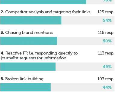
Journalists look for pitches that are backed up by data in the form of charts, graphs, tables, or interactive infographics. Infographic from a 2017 article in MarTech Advisor. Infographics also offer SEO opportunities for both the news outlet and the sponsor. 5 reasons to embrace data-driven PR.
Post an infographic (check out www.Fiverr.com to have on easily made). And read more articles at [link]. Make a plan and it will become super easy to do! Share an inspirational quote. Answer a frequently asked question. Post something seasonal. Share an image. Repost something that went well last year. Create and post a video.
You could write a “10 More X Tips” post, or expand upon points in a list post to generate several additional articles. You never know which notes you take from the event can become blog posts, videos, infographics or ebooks. Looking at your blog’s analytics, you can easily see which posts were the most popular.
The MarketingProfs article takes a data-driven approach to answering these questions, relying on powerful software from NewsWhip , which sifts media and online buzz to see which come out ahead. Data from the NewsWhip report was used to generate the Infographic, which was produced by Venngage , with assistance from Nadya Khoja.
This funny-yet-horrifying video was created by James Turner , a freelance journalist with an impressive background as a past senior editor at LinuxWorld Magazine who has written articles for prestigious publications such as the Christian Science Monitor and Wired.
Articles with images get 94 percent more views , and pictures get 37 percent more engagement than text posts on Facebook. Infographics can be especially useful because they explain complex topics with the use of visuals. Department of Treasury’s Bureau of Economic Analysis and put it in a colorful, informative infographic.
So whilst thinking about what formats can work best, try to avoid saying “I want to create an infographic” or “I want to create a video”. This is often easier than updating a more complex execution such as an interactive infographic because it is usually a case of updating copy and visuals with new ones. Static infographic.
It works really well for long lead stories, reminding me to check back three, four, six months later when an article finally is published. “In our world of getting-shorter-all-the-time attention spans, pictures (videos, infographics, etc.) This article originally appeared on Inc.com. ” This is a PR boon.
A similar study from Buzzsumo , that analyzed over 100 million articles, came to the conclusion that your content starts to perform really well when it is over 1,000 words — both when it comes to search engine rankings and social shares. According to the study, here are the most shared content types in order of popularity: Infographics.
A robust content marketing strategy involves a mix of valuable content: articles, blogs, case studies, infographics, podcasts, webinars, videos. This content is considered “valuable” because it has been carefully crafted. The post How to Secure Your SEO and Content Marketing Sweet Spot appeared first on Stern Strategy Group.
Include one link to the client, max of two (one in article and one in bio). One blog post can become a SlideShare deck, video, infographic, quote image. Help clients remember to share the article on social media; once for most platforms, but retweet it multiple times on the day it hits. How can you leverage content further?
For instance, if a blog post does extremely well, you can then make a video, slideshow and an infographic to get a better momentum. In the modern day, people consume information on the go, so they might not have the luxury to read through all the extensive articles. Offer Variety. Do you focus on creating textual content only?
Typical PR-generated content includes blog posts, opinion pieces, feature articles or testimonials, infographics, or videos. Content that educates and informs customers can build trust and authority in an industry or a company.
Ads pop up and disappear, while blog posts, news articles, and white papers stay searchable for months ie even years. Close behind are e-books (67%), infographics (66%), and blog posts (66%).” If you’re a scrappy startup or an early stage tech company, you may not have the capital for massive advertising budgets.
However, thanks to Hubspot’s extensive study of 13,500 content marketers, the verdict is in : they found that the sweet spot for content frequency is 16 posts a month; publishing 16 or more articles monthly will lead to 3.5 times more leads than if you published fewer than four articles monthly. They are: Infographics.
40 percent of adults respond better to imagery as compared to text-only articles. Think about how many times you’ve seen a text-based article go viral – and compare that to cute kitten photos, the ALS Ice Bucket Challenge or infographics. Check out the “PR Starter Kit” for pitching tips and more!
The truth is that your best articles and blog posts can find a new life in an entirely different form. Extract Data from your Content and Design an Infographic. People love infographics. So why not repurpose your written content into a well-designed and impactful infographic?
Want your audience to sit up and take notice of your posts and articles? Another easy way to take a blog post or other content to the next level is by creating an infographic with help from a site like Picktochart or Venngage. It’s a little like having access to endless Google Alerts without having to set them. DesignerPics.
A great pitch for me is a current news-based or thought leadership article that addresses an issue facing modern marketers today. What are the top qualities you look for when considering content submissions (byline articles)? Nobody likes to be tricked into reading ad copy when they think they’re reading informative articles.
Here is how you can leverage the various content types: Text : Create articles and blog posts that the readers will find useful and relevant. Infographics : Although it is a form of visual content, infographics are information rich. Infographics work great for blogs, Facebook and Pinterest. .
Search for a topic you’re considering and see what articles are already out there. So don’t expect to jot off a quick blog article and have it be good. Include a video post or infographic in your blog lineup. After you complete an article, read it. How can yours be different and better? Love What You Write.
In this article, 5W PR CEO Ronn Torossian and others share tips on how executives can use a blog and other social media avenues to spark conversations and conversions, establishing themselves as a leader within their industry. Think about just what you are trying to say in the article. Avoid writing too much about numerous things.
What’s their writing style, what’s their background, is there a common thread in their articles? You’d pay for a photo shoot or an infographic or a video production, right? My favorite social media platform is … There are a ton of interesting articles on Facebook and I uncover a ton of pitching material through reading.
Don’t neglect the basic plot; exposition, rising action, climax, falling action and resolution can play a role in designing a visual story or an asset like an infographic. In the case of an infographic, you can use different design principles for different effects. They also can be broken so as to emphasize a key point.
This article is in honor of their dedicated participation so far, and to further help my students and any other students and professionals who are new to Twitter and want to successfully grow their communities and follower base. I started out using Pablo by Buffer and Canva and now I’m a Piktochart power user. Participate in Twitter chats.
We organize all of the trending information in your field so you don't have to. Join 48,000+ users and stay up to date on the latest articles your peers are reading.
You know about us, now we want to get to know you!
Let's personalize your content
Let's get even more personalized
We recognize your account from another site in our network, please click 'Send Email' below to continue with verifying your account and setting a password.


Let's personalize your content