This site uses cookies to improve your experience. To help us insure we adhere to various privacy regulations, please select your country/region of residence. If you do not select a country, we will assume you are from the United States. Select your Cookie Settings or view our Privacy Policy and Terms of Use.
Cookie Settings
Cookies and similar technologies are used on this website for proper function of the website, for tracking performance analytics and for marketing purposes. We and some of our third-party providers may use cookie data for various purposes. Please review the cookie settings below and choose your preference.
Used for the proper function of the website
Used for monitoring website traffic and interactions
Cookie Settings
Cookies and similar technologies are used on this website for proper function of the website, for tracking performance analytics and for marketing purposes. We and some of our third-party providers may use cookie data for various purposes. Please review the cookie settings below and choose your preference.
Strictly Necessary: Used for the proper function of the website
Performance/Analytics: Used for monitoring website traffic and interactions
Flo from Progressive Insurance is an excellent example. Insurance is not a particularly fun industry, but by creating a character that people like, Progressive can develop tons of Flo-related content. Infographics can be especially useful because they explain complex topics with the use of visuals.
Of six sectors measured in a recent survey, the insurance industry had the most opens per opener at 4.2. Companies that have been quick to migrate from spreadsheets and PowerPoint to infographics also attract more attention. Infographics that are simple but get the major message across clearly and quickly will always win.
Think of it this way: RBC’s personal and commercial banking division will care about different topics than the insurance division. The insurance company developed a system that tracked savings, and over a six-month span, it avoided $1.2 If scaling is the goal, consider efficiency from an exec’s perspective.
This infographic from the Insurance Institute for Business & Home Safety (IBHS) presents practical tips for solo and solo plus businesses to follow. .” Preparation is a critical and often overlooked step in the day-to-day but could quite literally save your business.
While importing curated lists like the lists from Alltop is a good start, sometimes you’re looking for specific opportunities – like infographic placements or product reviews. For example, someone building links for a car insurance site will plug in “Car Insurance” instead of “Car Maintenance inurl:category/guest”.
These concepts would have worked equally as well for clients in the realms of property, house insurance, travel insurance, travel, finance and more. Infographics. The Cambridge Dictionary defines an Infographic as, ‘A picture or diagram or a group of pictures or diagrams showing or explaining information’.
Content related to mortgages, insurance, and financial planning has a way of becoming predictable over time—unless you get a little creative. They also launched a series of women-centric infographics , such as “Bridging the Funding Gap,” which highlighted the stark funding disparities women entrepreneurs face. infographic.
The insurance company Travelers transformed its white paper on managing the risks of AI into a multimedia webinar. Get creative, and think about ways to turn your white paper content into social media posts, videos, infographics, and even podcast episodes.
While importing curated lists like the lists from Alltop is a good start, sometimes you’re looking for specific opportunities – like infographic placements or product reviews. For example, someone building links for a car insurance site will plug in “Car Insurance” instead of “Car Maintenance inurl:category/guest”.
To create the index (as some call it), I weighted a handful of criteria, such as homeowners insurance and transportation costs, and then assigned scores for over 800 cities. Insurance site Insurance.com lets you compare quotes for various insurance types. As users fill out online forms, they constantly collect data.
For example, a survey piece, a data study, or a story with heavy visual elements like an infographic or map could all be considered hero content. For instance, a brand may utilize datasets to create a map or infographic and pitch it together. Here are some specific examples of Hero content: Surveys.
Value can be something like a pitchable asset, such as this construction statistics post, which includes an infographic that can be pitched for coverage: But another way to create value is by using proprietary data for your statistics posts. And to make something pitchable, you need to give something of value.
There’s a common misconception that companies in conservative fields like finance, insurance, and healthcare have a harder time creating content. It’s a wide umbrella, spanning everything from consumer banking, investment banking, credit cards, fintech, insurance, and more. Create social videos and infographics.
And we would create these like infographics, like that was kind of like a big, the big strategy you, you create, like, here’s the best, you know, the science backed best flowers for your home, you know, for air quality or something for some flower client we had. So you say they’re about insurance.
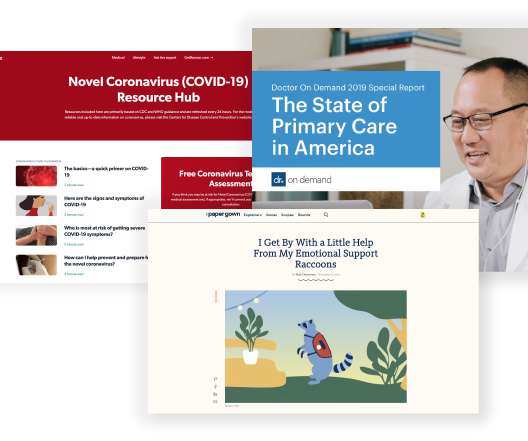
More importantly, what should doctors, hospitals, insurers, and healthcare companies do to improve the state of healthcare content online? Oscar, founded in 2012, has a very simple tagline: “Health insurance made easy.” Animated videos and infographics, for instance, can make a site come across as more innovative and trustworthy.
Internal meets external comms: Zurich Insurance In the past 10 years organisations have slowly shifted from trying to lock down employee social media activity to promoting policies and procedures that actively promote its use. It will almost certainly require a new type of politician to provide leadership to help the UK thrive.
More importantly, what should doctors, hospitals, insurers, and healthcare companies do to improve the state of healthcare content online? Oscar, founded in 2012, has a very simple tagline: “Health insurance made easy.” Animated videos and infographics, for instance, can make a site come across as more innovative and trustworthy.
We organize all of the trending information in your field so you don't have to. Join 48,000+ users and stay up to date on the latest articles your peers are reading.
You know about us, now we want to get to know you!
Let's personalize your content
Let's get even more personalized
We recognize your account from another site in our network, please click 'Send Email' below to continue with verifying your account and setting a password.


Let's personalize your content