This site uses cookies to improve your experience. To help us insure we adhere to various privacy regulations, please select your country/region of residence. If you do not select a country, we will assume you are from the United States. Select your Cookie Settings or view our Privacy Policy and Terms of Use.
Cookie Settings
Cookies and similar technologies are used on this website for proper function of the website, for tracking performance analytics and for marketing purposes. We and some of our third-party providers may use cookie data for various purposes. Please review the cookie settings below and choose your preference.
Used for the proper function of the website
Used for monitoring website traffic and interactions
Cookie Settings
Cookies and similar technologies are used on this website for proper function of the website, for tracking performance analytics and for marketing purposes. We and some of our third-party providers may use cookie data for various purposes. Please review the cookie settings below and choose your preference.
Strictly Necessary: Used for the proper function of the website
Performance/Analytics: Used for monitoring website traffic and interactions
Today’s press releases work harder – they attract journalists, reach consumers directly, boost SEO rankings, and generate social media buzz. This evolution reflects broader shifts in how people consume information and how search engines index content. According to Pew Research, 48% of adults get news from social media.
Here at SHIFT, we coupled our love of candy and data to create the infographic below ( click for larger image ) showcasing consumers’ Halloween candy buying and spending habits. Like most creative pieces, the infographic was an evolution and team effort that didn’t happen overnight. Creative Data Marketing'
For many B2B technology brands, data is not only a business asset, but a PR tool. No one should underestimate the power of data for storytelling. The data is often derived inexpensively from behavior surveys or flash polls, or it may already exist within the company’s own research unit. 5 reasons to embrace data-driven PR.
A well-crafted press release can do just that — increasing consumer awareness, connecting you with influencers and helping to generate new business. A century later, companies have to do a lot more to get the attention of not only newspapers but also a newly expanded audience of blogs, influencers and consumers. Example: ‘I Quit!
Is tangible data the draw to your IR site – or are institution investor looking for more soft, intelligence? . Institutional investors live within their Bloomberg-type terminals and have all the data times five. So why are they visiting your IR website? Question 5: This question and its answer always seem counter intelligent to me.
A few weeks back, I was reminded of this when I read an infographic titled The Data Behind What Makes an Effective Sales Process. I’ve heard stats like this throughout my career and in business school; I’ve experienced it as a consumer. Here’s the complete infographic: (click the image to enlarge it). The result?
SumAll : Earlier in the year, I wanted to find a tool that gave me a comprehensive view of my social media data. SumAll allows you to look at your Twitter data over time and to look at data sets together for a more complete picture of your activity. Then, a peer recommended SumAll, after a lengthy Facebook discussion.
This clearly indicates, as stated in the IR magazine article – Investors visit IR websites for content, not data, finds survey – that the IR website is “…a de rigueur tool that investors expect to find.”. More to the point, where do they want to consume it? It’s where they receive their data and breaking news.
Now in its fifth year, this exclusive study asks investors 30 tactical questions regarding how they consume your shareholder communications content. The strongest strategic take-away I have made from this is the IR website is not quite the power tool I always imagined: the key data is very redundant on Bloomberg terminals, etc.
Infographics demonstrate your brand’s expertise in your industry. The same HubSpot report indicates that users are more likely to consume videos in full (55 percent) than any other form of online content. However, it is also an opportunity to stay up-to-date with consumers or journalists who already follow your company.
Infographics. I love infographics. I’m not alone, over 40 percent of marketers say infographics are their most engaging piece of content. Infographics are easy to read, easier to digest and boost engagement by up to 3x. To promote an infographic, you first have to create an infographic. more views.
This implies that the IR website is not a highly trafficked data tool for your current analysts, but certainly they do check in to see what new content you’ve added to expand your “financial narrative.” Question 4 coming soon. About the Shareholder Communications 365 Study.
In June, at the State of the Internet Webinar, comScore presented data indicating mobile users would surpass desktop users in 2014. In October 2014, comScore provided data to Internet Retailer that showed that 52% of the time consumers spent online occurred within smartphone and tablet apps. And they were right. Mobile Web.
Infographics. Informative, aesthetic infographics drive immense engagement. Infographics are plug and play, citable and are liked and shared 3x more on social media. OpenTable used infographics to garner earned media and boost engagement from targeted yet unexpected audiences. How to do it? How to do it? White Papers.
The internet has changed the way we discover and consume information. In fact, content discovery helps both consumers and online marketers. Here is how: Consumers find desired data/information quickly without having to scour through hundreds and thousands of search results. The focus was more on quality of content.
Research shows that 70% of consumers prefer getting to know a company through articles rather than ads, according to Nielsen. Focus on truly newsworthy announcements and include multimedia elements like images, videos, and infographics that make your story more shareable. Press releases still matter but require a modern approach.
Social media has revolutionized the way alcohol brands connect with consumers. Consider using videos, infographics, quizzes, and live streams to cater to diverse preferences. This data can help brands refine their strategy and optimize their content for better results.
A survey by Spiceworks Ziff Davis found B2B tech marketing prospects say they consume 11 or more piece of vendor content Pieces of content. According to a survey by Spiceworks Ziff Davis, about half (47%) of B2B technology decision-makers say they consumed 11 or more piece of vendor content over one year. Consumption. Try our services.
When I am seeking to access financial data. This makes sense considering that the key financial data is very redundant on their Bloomberg terminals, etc. This makes sense considering that the key financial data is very redundant on their Bloomberg terminals, etc. How shareholders consume shareholder communications content.
And, we know most people who are consuming that digital media are probably just scanning and reading headlines (if that). But doesn’t most of this data we’re seeing imply that our customers and targets want to consume: videos, photos, infographics and short messages (via private messaging apps)? Blog posts.
It’s a powerhouse for consumer public relations success. Why is social media so attractive to consumers? Understanding why social media is so attractive to consumers is key to leveraging it for PR success. Consumers can connect with friends, family, and like-minded individuals globally, fostering a feeling of belonging.
You can also provide feedback sessions with your target audience during interviews or start gathering post-service survey data. Go-To free tools Use social listening tools, check Google Trends data as well as native social media platform analytics. These tools help you raise brand awareness and manage it with real data.
We aggregated outreach data from over 12,000 campaigns across 2,000 active BuzzStream accounts and analyzed it to understand reply rates by campaign. The most striking aspect of the data we analyzed is the sheer range of the distribution. Based on the data, fake personalization actually generates a -1.3% Methodology.
A recent Nielsen study found that expert content is “the most effective source of information in impacting consumers along all stages of the purchase process across product categories.” Media outreach, using credible, third-party experts, achieves higher consumer engagement and conversion numbers. Which Data Points to Track.
With the increasing popularity and adoption of digital marketing, data has become the heart and soul of the marketing profession. Companies that relied on the interpretation of data and wisely employed it have performed extremely well. Mint’s discovery and sharing of its data propelled it as a go-to source for trends.
and clearly articulates the who, what and why Includes compelling, high-quality visuals: photos, videos, infographics or data visualizations Features content that adds credibility and validation: unique data or research, testimonials or quotes from experts or executives Is formatted strategically (e.g.
That’s according to a survey of 1,200 “social dads” by Social Media Link and presented in the infographic – Dads Do Social – published nearby. In perusing the data, I could see a reflection in many of the conclusions. The infographic strikes me as an accurate profile or buyer persona of dads who are active on social media.
Barnes again, I just don’t see that in the data. I see tepid interest in small pockets of consumer oriented businesses among the Fortune 500. It’s worth underscoring, I am not quibbling with the research, methodology, or data. Infographic: Millennials and Social Commerce. For example: 13 Statistics from an Inc.
Leveraging First-Party Data for Unique Insights The product-led approach creates original insights and reports using proprietary data. Repurposing Data Across Content for Long-Term Value To maximize the ROI of the data-driven reports, they then by repurpose insights across various content formats (SEO posts, product pages, etc.).
Many of the blog posts published here are based on survey research, analytical studies or other sources of data. The Deloitte and the CMO Club survey also found, “The most sought-after skills: data science (78%), analytics (68%), and user experience (60%).”. Source: A PR View of Media Bias [Survey Data] ). Are PR pros truthful?
This will ensure that you include important keywords or data in your headline because they are relevant to your news. One way to see if your news release headlines are working is to see how reporters revise them in their coverage pieces or how consumers translate your news in their social updates. Let Your Coverage Be Your Guide!
I read ebooks, and the majority of online consumers enjoy them as well. That being that case, it makes sense to give your popular posts a new life — since they have been consumed and enjoyed by your audience. Extract Data from your Content and Design an Infographic. People love infographics.
As much as video content has grown in advertising, marketing, and PR , data shows that it continues to expand. Video enhances SEO, has the best ROI, keeps consumers engaged longer, and is more shareable than many other content forms. That was the case with Equifax CEO Rick Smith’s wooden response to the 2017 data breach.
He coined “ content shock ” and argued that though more and more businesses give away more and more content, people have only finite time to consume it. Use data and even phone calls to build a comprehensive picture of your audience.”. How does my audience prefer to consume content? Is this the end of content marketing?
Yet, editors at major outlets like The Washington Post receive very few charts, visualizations or data. Help reporters reach these on-the-go content consumers by pitching videos, infographics or other mobile-friendly multimedia. Deliver Data. Then, think of an interesting way to present the statistics and insights.
You can dig through your research and data to create buyer personas. Conduct a content gap analysis Now that you have goals and data, you’re almost ready to begin producing new content. Modern consumers meander, zig-zagging in and out of stages, influenced by a multitude of touchpoints along the way.”
A few years ago, I created the Social Media Strategy Wheel Infographic for PR professionals. The Infographic is a visual graphic broken down into different areas of focus, which are critical during the planning process. We are in an age of PR Tech and data literacy. The Social Media Strategy Wheel.
Additionally, alert those who previously consumed your content when more is available. For example, blog posts, social media posts, infographics and video clips are all ways to break down larger pieces of content and reach audiences across multiple platforms. The other 80 percent should focus on promotion.
In running high-profile consumer and B2B public relations campaigns over the years, we’ve learned some important tricks for making surveys work harder. Don’t mix in unnecessary questions or choices that could end up clouding your data. Survey data is good for a year, at least. Keep the results you’re looking for in mind.
It’s also tactics like content marketing, a broad umbrella that includes blogging, social media updates, email marketing, infographics, visuals and video. MarketingProfs says, “The implied endorsement of third-party experts holds much more weight to consumers than anything a company can say about itself.” Publication and promotion.
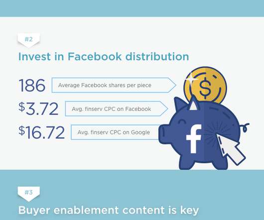
It’s a wide umbrella, spanning everything from consumer banking, investment banking, credit cards, fintech, insurance, and more. Companies in this space have a unique opportunity to build meaningful relationships with consumers. Data for this report was compiled in November 2019. Money affects everyone. Report Methodology.
Before you compose your questionnaire, determine what you want the survey to accomplish, what data is most meaningful to your brand, and what would interest relevant media. Professionals will also work with you to create the most economic survey, and importantly, help you understand the data once it’s been collected.
73% of consumers say [that] to win their support, companies must show how they are supporting communities and the environment. Adobe: Harnessing Data Power Adobe’s forecast of $221.8 Press release examples like the following effectively use data to paint a picture of consumer behavior during the holidays. billion in U.S.
For consumers, this means those sneakers are less likely to stalk you around the internet just because you browsed Zappos one time. So, future sneaker shoppers may wind up in a cohort of runners—but their individual data won’t be isolated or easily identifiable (allegedly). For brands, however, it means a paradigm shift.
We organize all of the trending information in your field so you don't have to. Join 48,000+ users and stay up to date on the latest articles your peers are reading.
You know about us, now we want to get to know you!
Let's personalize your content
Let's get even more personalized
We recognize your account from another site in our network, please click 'Send Email' below to continue with verifying your account and setting a password.


Let's personalize your content