This site uses cookies to improve your experience. To help us insure we adhere to various privacy regulations, please select your country/region of residence. If you do not select a country, we will assume you are from the United States. Select your Cookie Settings or view our Privacy Policy and Terms of Use.
Cookie Settings
Cookies and similar technologies are used on this website for proper function of the website, for tracking performance analytics and for marketing purposes. We and some of our third-party providers may use cookie data for various purposes. Please review the cookie settings below and choose your preference.
Used for the proper function of the website
Used for monitoring website traffic and interactions
Cookie Settings
Cookies and similar technologies are used on this website for proper function of the website, for tracking performance analytics and for marketing purposes. We and some of our third-party providers may use cookie data for various purposes. Please review the cookie settings below and choose your preference.
Strictly Necessary: Used for the proper function of the website
Performance/Analytics: Used for monitoring website traffic and interactions
Here at SHIFT, we coupled our love of candy and data to create the infographic below ( click for larger image ) showcasing consumers’ Halloween candy buying and spending habits. Like most creative pieces, the infographic was an evolution and team effort that didn’t happen overnight. CreativeData Marketing'
Data and research. PR people should never let good data go to waste. There’s often the opportunity to package existing internal data, which can offer an opportunity for PR teams to convey expertise or make news. Data visualizations. Just because you don’t have a full report doesn’t mean the data is useless.
Years ago, I was a PR person working at a creative marketing communications agency. The company had three distinct divisions: PR / Communications (that was my area), Creative Marketing & Advertising and Web, Multimedia & Video. We shared ideas, concepts and I was able to watch how creative ideas came to life.
If you’re working with a data-driven PR firm, chances are at some point in your relationship you will be asked to grant access to a variety of marketing and data systems. Systems you may be asked about: market research, previous campaign performance data. What systems might you be asked about, and why? Earned Media. Paid Media.
Download the full PDF version of the infographic here . You now have the data. Facebook’s demographic data allow you to use their knowledge to inform your PR and marketing choices and tailor the type of content you share in your posts, stories, and ads. 2023 is right around the corner. Build a community of loyal advocates.
Infographics. I love infographics. I’m not alone, over 40 percent of marketers say infographics are their most engaging piece of content. Infographics are easy to read, easier to digest and boost engagement by up to 3x. To promote an infographic, you first have to create an infographic. more views.
The data-driven world has significantly reshaped the way the communications industry works. In today’s most noticeable creative PR strategies, measurement and data-based insights are key. Before you begin a creative PR campaign, define your specific goal(s) and detail how your strategy and tactics support it.”.
Some of the most exciting content being published today includes some sort of data visualization. Great data visualization often times requires coding, and coding is not a skill set that everyone shares. Great data visualization often times requires coding, and coding is not a skill set that everyone shares. And it’s free.
Some of the most exciting content being published today includes some sort of data visualization. Great data visualization often times requires coding, and coding is not a skill set that everyone shares. Great data visualization often times requires coding, and coding is not a skill set that everyone shares. And it’s free.
Although that notion might seem right at first glance, a bit more digging reveals content for any industry can be exciting and engaging — all you need to do is think about creating content differently and add some extra creativity. Infographics can be especially useful because they explain complex topics with the use of visuals.
However, navigating the complex regulatory landscape while maintaining creative integrity is a delicate balancing act. Remember, a balance between compliance and creativity is essential to succeed in this dynamic landscape. Consider using videos, infographics, quizzes, and live streams to cater to diverse preferences.
Early in my career, I''d declare I''m part of the creative class, in part, because of my dislike for math. And every public relations professional should love math and, more specifically, data. 1) Inform Strategy: Since hugging it out with data, I''ve been able to show clients exactly why I''m proposing a specific editorial strategy.
Infographic. If you are announcing research or statistics you’ve put together, infographics can be a great tool for visually relating them. You can create your own infographics with Piktochart or hire a professional designer. Here are more tips: Provide data not offered in the press release. Use simplistic imagery.
I sense we are reaching that point in marketing, with respect to data and creativity. For years marketing leaders have all heard data, data, data. While clearly data has an important role in marketing decisions, the community is also beginning to recognize data has several limits ( click fraud aside ).
Creative people are the heart and soul of marketing and communications. Having managed both creative and analytical people over the years has taught me a few things. Having managed both creative and analytical people over the years has taught me a few things. They have the ability to make raw and bland information interesting.
Quill untaps the potential of your data. We know it’s all about the data. But your data is only of value if you can use it to plan and create better content or refine strategy. Quill transforms data into automated, human-sounding Intelligent Narratives that offer brand insights to improve every aspect of communication.
We aggregated outreach data from over 12,000 campaigns across 2,000 active BuzzStream accounts and analyzed it to understand reply rates by campaign. The most striking aspect of the data we analyzed is the sheer range of the distribution. Based on the data, fake personalization actually generates a -1.3% Methodology.
Decide on the data that matters. When crafting your visual story or assets, determine the data that matters. Don’t neglect the basic plot; exposition, rising action, climax, falling action and resolution can play a role in designing a visual story or an asset like an infographic. Not all images tell your story well.
For example, if at the outset, a PR goal was to increase sign-ups for a cause or event, that data should be tracked and offered as a metric. Many also look for over-the-top creativity or that unique “something.” ” Do prioritize. And we don’t mean just a spreadsheet of titles and due dates.
Be compelling and creative, but get to the point quickly. This could be a video, photos or an infographic. Think about how you can share your news in a creative way. Think about how you can share your news in a creative way. Be careful not to be too promotional. Multimedia. Today’s audiences are overwhelmed by text.
Limited is the operative word, because while measurements are important, you can’t directly measure everything, like the impact of creativity, and yet we know these things have value. 1) Creative and analytics as whole-brained partners. I’m afraid the creative process will lose its soul,” said one CMO but those fears are overblown.
Is creativity a talent or a skill? It seems to me if creativity is a talent it can be fine-tuned, like a natural athlete trains to compete in professional football. On the other hand, if creativity is a skill, it can be taught in the same way, we might teach our children to throw or catch a football. Or it might remain elusive.
Now, I’m not the most creative person in the world. In this infographic from Wishpond , I’ll show you 14 data-backed techniques for designing higher-converting landing pages. So the ‘art’ side of this isn’t the easiest for me. Fortunately, I’m good at research.
What I wasn’t initially anticipating within the field is the creativity, anticipation and thrill it entails when conceiving campaigns, writing pitches and landing links. However, creative content surrounding your client’s core areas of expertise should be prioritised, in order to attract coverage on the right sectors and publications.
Despite the title, these ideas are high value, which is pretty clear in her first example about data: “Look no further than Under Armour’s acquisition of mobile apps MyFitnessPal and MapMyFitness to see this business benefit in action. 3) Rising influence of creative in content marketing. We test everything to see what works.
GUEST POST by Mike Falkow, Creative Director of Meritus Media. And unless you are a bikini model posting photos of yourself posing on a tropical beach somewhere, you will have to be creative in how you present your message. Infographics are your key language elements here. This platform is more about a visual journal of sorts.
Data for this report was compiled in November 2019. Data in the second part of the report came from StoryBook, Contently’s content strategy tool, which measured top-performing topics, formats, social shares, and more for 2,292 pieces of content from financial services companies. The benchmark data raised a few big questions.
For example, they’re much more likely than peers to be tapping into data monetization initiatives or new ventures.”. Statistics that stood out: 26% more likely than peers to claim ownership of the customer journey from the first contact through to sales and service – and “benefit from the insights derived from that data.”. “29%
Before you compose your questionnaire, determine what you want the survey to accomplish, what data is most meaningful to your brand, and what would interest relevant media. Professionals will also work with you to create the most economic survey, and importantly, help you understand the data once it’s been collected.
The key to unlocking this potential lies in crafting content that resonates deeply with the target audience, which companies can do when they work with a creative agency. Outlining the types of content to be created, such as blog posts, videos, infographics, and social media content, and establishing a consistent publishing schedule is vital.
5 – Get Creative. Getting (and staying) creative can be difficult. Her creativity has allowed her page to quickly amass over 35,000 engaged followers. Here’s what keeps her creative: “My three children are definitely the inspiration for my feed. comScore 2016 U.S. Cross-Platform Future in Focus. Instagram: [link].
The focus on measurement in marketing has become so intense that some argue it’s choking creativity. However, a darker side of measurement is emerging with a glut of spam and erroneous data. Amid the epidemic of fake news, the industry can ill afford a controversy that calls into question the veracity of data.
Smart, strategic PR doesn’t require a massive budget – it demands creativity, relationship-building, and consistent execution. Focus on truly newsworthy announcements and include multimedia elements like images, videos, and infographics that make your story more shareable.
#CreativePR, the hashtag, caught our attention at last year’s PRSA conference when Deirdre Breakenridge, Jason Sprenger and Heather Whaling teamed up for their presentation, “Creative PR: Delivering Your Story From Narrative and Design to Measurement.” When you can, offer high resolution photos, videos or infographics. She holds a B.A.
What must also be kept in mind is that creativity and innovation don’t come in a vacuum. If you want to see who are seen as the best both by data and peer review, then typing a search term, such as “Top Content Marketers,” will be revealing. Cool infographics. ” – Henry Ford. Big full-screen images.
While this may have fallen under the marketing team more so than a communications team in the past, the landscape of PR and marketing is evolving and becoming more interdependent and data-driven. Use this data to create additional opportunities for engagement and conversion on those high-traffic areas. Test paid ad channels.
One of Pinterest’s best monetization features to date has been the ability to enhance product pins with pricing and other data. Known as “Product (Rich) Pins” this additional product data can be easily added via oEmbed or semantic markup like Open Graph or Schema.org. Businesses are doing creative stuff with Pinterest.
Former White House CIO Theresa Payton addressed the Internet of Things and how today’s hyper-connectivity to the internet means that a data breach is inevitable. The best way to handle a data breach as a PR professional? The best way to handle a data breach as a PR professional? Cision (@Cision) October 24, 2016.
So, future sneaker shoppers may wind up in a cohort of runners—but their individual data won’t be isolated or easily identifiable (allegedly). states like California and Maine are creating their own data privacy regulations that may restrict retargeting in its current form. In the U.S., “The question will be how much.
Decisions need to be made in advance of creating content: Ask yourself if there are internal resources internal available to develop the content and determine a budget for creative executions. Is there an opportunity to create one long form piece of content that can be utilized across different channels?
Most organisations use more elements like online videos, infographics and instant photos in their messaging. However, longitudinal data collected since 2007 from nearly 25,000 communication professionals throughout Europe has repeatedly found the strategic alignment of communication and organisational goals as the most important issue. #4
We also went over the top of the marketing funnel, typically reserved for blog posts, infographics, and other types of shorter content meant to educate and entertain. On athenaInsight , the brand’s main publication, creators explore healthcare trends, speak to issues affecting physicians, and unpack the latest medical data.
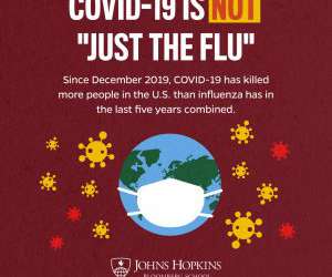
On social media, what creative tactics did the team use to tap the faculty’s expertise? When it comes to presenting data, it is important to include the statistics that get particular messages across. A great example of this was our “COVID is Not the Flu” infographics, which reached over 20 million users on Facebook alone.
We took published user base data for as many social networks as we could round up, loaded them into analytics software, and turned the data into treemaps. Then we cut the treemaps into individual squares and gave them to our Creative Services team. Analytics DataData-Driven PR Infographic'
We organize all of the trending information in your field so you don't have to. Join 48,000+ users and stay up to date on the latest articles your peers are reading.
You know about us, now we want to get to know you!
Let's personalize your content
Let's get even more personalized
We recognize your account from another site in our network, please click 'Send Email' below to continue with verifying your account and setting a password.


Let's personalize your content